Outline of the Article:
- Introduction to CSS Box Model
- Understanding the Box Model Components
- H1: Content
- H2: Padding
- H2: Border
- H2: Margin
- Significance of CSS Box Model in Web Design
- How the Box Model Works
- CSS Example Demonstrating the Box Model
- Common Issues with the Box Model
- Best Practices for Using the CSS Box Model
- Impact of Box Sizing Property on Box Model
- Differences in Box Models in Different Browsers
- Responsive Design and the CSS Box Model
- Advanced Techniques for Working with the Box Model
- Conclusion
Understanding the CSS Box Model: A Comprehensive Guide

Introduction to CSS Box Model
When it comes to web design, understanding the CSS Box Model is fundamental. It lays the foundation for how elements are rendered and displayed on a webpage. At its core, the CSS Box Model describes the design and layout of every HTML element on a webpage.
Understanding the Box Model Components
Content
At the heart of the Box Model lies the content itself. This refers to the actual information or visuals contained within an HTML element.
Padding
Padding is the space between the content and its border. It helps in enhancing the visual appeal of elements by providing breathing space.
Border
Borders define the boundary of an element. They can vary in style, thickness, and color, accentuating the structure of an element.
Margin
Margins separate one element from another. They create space between elements, ensuring they don’t appear cluttered or overly condensed.
Significance of CSS Box Model in Web Design
The CSS Box Model is crucial as it enables designers and developers to precisely control the layout and spacing of elements on a webpage. It ensures consistency and helps achieve desired visual aesthetics.
How the Box Model Works
The Box Model operates by calculating the total width and height of an element by summing up the content, padding, border, and margin.
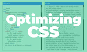
.example-box {
  width: 200px;
  padding: 20px;
  border: 2px solid #000;
  margin: 10px;
}
This CSS snippet demonstrates how the different components contribute to the overall size of an element.
Common Issues with the Box Model
Sometimes, unexpected results occur due to misunderstandings or miscalculations within the Box Model. Common issues include elements overflowing their containers or layouts not behaving as intended.
Best Practices for Using the CSS Box Model
To avoid issues, adhering to best practices is essential. This involves using consistent units of measurement, understanding how properties interact, and leveraging tools for debugging.
Impact of Box Sizing Property on Box Model
The box-sizing property influences how the width and height of an element are calculated. It can be set to content-box or border-box, impacting the Box Model’s behavior.
Differences in Box Models in Different Browsers
Browsers may interpret the Box Model differently, leading to inconsistencies in layout and spacing. Understanding these differences is crucial for cross-browser compatibility.
Responsive Design and the CSS Box Model
In responsive design, the Box Model plays a pivotal role. Techniques such as media queries and flexible box layouts help create adaptable designs across various devices.
Advanced Techniques for Working with the Box Model
Advanced developers employ techniques like flexbox and grid layouts to streamline the management of the Box Model, enhancing responsiveness and layout control.
Conclusion
In conclusion, mastering the CSS Box Model is integral to creating visually appealing and well-structured web layouts. Understanding its components, best practices, and potential issues allows for efficient and effective web development.
FAQs
- What is the primary function of the CSS Box Model?
- The CSS Box Model defines how elements are laid out and spaced within a webpage, including content, padding, border, and margin.
- How does the
box-sizingproperty impact the Box Model?- The
box-sizingproperty determines how an element’s width and height are calculated, affecting the overall layout.
- The
- Why is understanding the Box Model important in responsive design?
- Understanding the Box Model is crucial in responsive design as it helps create layouts that adapt seamlessly across different devices.
- What are some common issues with the Box Model?
- Issues like overflowing elements or unexpected layouts can occur due to misunderstandings in the Box Model calculations.
- What are some advanced techniques for working with the Box Model?
- Advanced techniques include using flexbox and grid layouts to efficiently manage and control the Box Model in web development.